Behind the Scenes 1/2
Je Bella Cesta
How do you know someone is dedicated to their work? In my case, I moved into a friend’s place just because she had cable TV, covered her apartment with sketches, became a tourist in my hometown, taking pictures of famous buildings all around the city. I finally put all the clicks and sketches together, and with the help of some animation, made something as comical and quirky as the show it would introduce. Back to project or straight to — BTS 2/2.
Sketched wall at my friend's place, that expanded to 5 meters length.
Intro animation sketches.
Late-night sketch comedy show Je Bella Cesta aired to prime-time audiences. The opening credits hence had to look fresh and funny, while retaining the sense of elegance conveyed by the show’s main host, Klemen Slakonja.
He, his personality and work, served as the compass for creating all visuals. The image and identity also required flexibility as the show and its subject matter evolved. The opening titles needed to be updated weekly with the trailer for that episode — basically, a new intro every week.
Intro credits with inserted modular themes in between.
Almost exact illustration of the famous Ljubljana buildings.
There were even fast cars on the streets driving around.
But before we did all the attention-grabbing eye-candy, we needed to design an identity. Je Bella Cesta literally means “the white road”, but the real meaning is something you can use when an unexpected situation happens, whether it’s breaking a wine glass or stepping in dog poo.
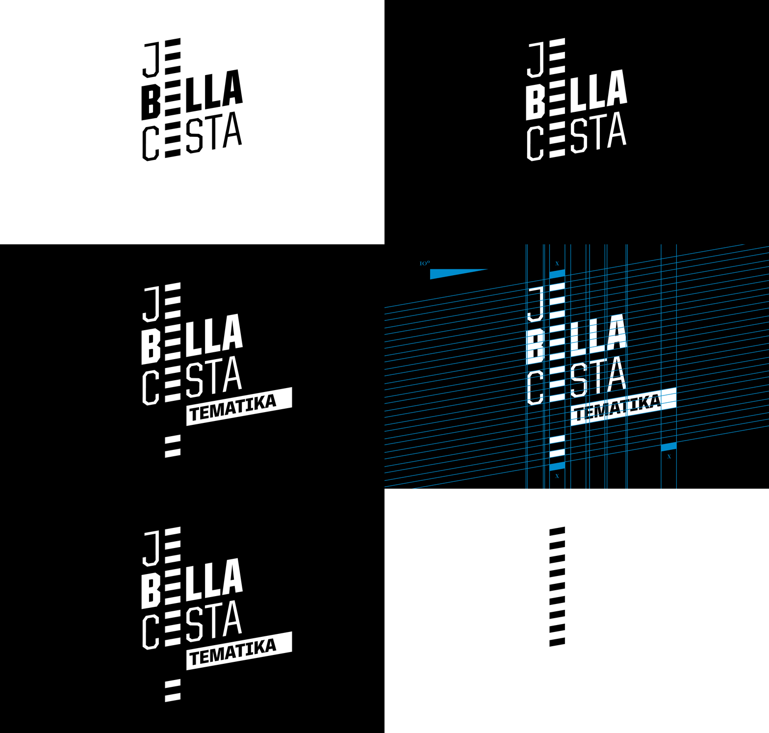
The logo treats the words of the title as separate elements that are arranged on the same white street, and allows the theme of each episode of the show to be placed within. The structure is endlessly adaptable and reflects the character of the show with its italic angle and attitude.
Most importantly, it serves as a visual starting point for all the other elements such as lower thirds, push transitions, all the way through to the closing credits at the end.
Concept sketch with modular integration of various theme titles.
Modular identity with and without show's theme.
Anatomy of screen design and animated logo placement.
Basic animation language for the show.
Other elements that needed to be incorporated within the main logo style.
Graphics were animated to Klemen’s voice and song work, giving rhythm to the visual appearance. The Slovenian language is not a very melodic one, therefore the movements needed to be sharp, linear and direct.
In addition to the intro and outro animations, we created another intro animation for a smaller show within the main show, called Bahir and Zahir. This was the first Turkish-Slovenian telenovela featuring Goran Hrvačanin and Mario Čulibrk, as two Turkish investors, trying to conquer the world with Cokullah, hand made wooden shoes.
Again, it’s a very narrative animation, based on a song discussing their wooden shoes and plans to take over the world.
Conquering the world with Cokullah, hand made wooden shoes.
Slovenian country in a shape of a chicken. Chicken egg.
Loosely inspired by the mighty famous MGM Studios, the closing credits imitated (after all, the entire show is about imitation) the roaring lion, only with the main character of our show, the zebra.
Eventually she (yes, it's a she) decided to roar as well. But because she cannot do it properly (let’s be honest, zebras don’t roar), she has a hiccup and loses all her stripes as they come tumbling into the design of closing credits and Je Bella Cesta identity.
To make things more complicated — it needed to be different and modular for every show. Hey, if it’s going to be complex, let it be complex until the end!
Roarrring closing credits with hiccup zebra and running street at the end.
The end — interchangeable credit street falling out of zebra stripes.
Oh, where did I find a zebra in Ljubljana? Crossing a lot of streets and when eventually looking down, I saw that every single crossing had zebra stripes. They inspired the main character for the show, the little zebra.
As you can see, she was a part of everything, even every single of the extra 11 funny trailers.
Disciplines: Motion Graphics, Visual Identity
Additional Credits: Ante Orlić, Martin Bezjak, Andrej Intihar


